MyCanal
Design System
MyCanal is the Canal+ Group's digital platform, launched to offer an enriched on-demand TV and live broadcasting experience. It is at the heart of the Canal+ Group's digital strategy to adapt its offering to the age of streaming services, while capitalizing on its exclusive content.
Context
In 2021, MyCanal, Canal+'s streaming platform, has undertaken a significant transformation of its product teams to adapt to new user expectations and changes in the streaming market.
Team
The MyCanal product team turned to agile methods.Short development cycles with regular sprints, frequent retrospectives to adjust priorities, and constant collaboration between the product, design and technical teams. This approach made it easier to take user feedback into account, and enabled the roadmap to be rapidly adapted in line with market developments and real-time feedback.
The company also reviewed the composition and organization of its product teams. Specific roles such as Product Managers, Product Owners, and UX/UI designers have been reinforced. There has been an effort to better define roles and responsibilities, while encouraging interdisciplinary collaboration between developers, designers and marketing specialists.
Problematic
The product team's aim was to make the platform more intuitive and personalized for its users. This involved optimizing the interface, improving search and recommendation functionalities, and simplifying user paths (registration, content navigation, video playback).
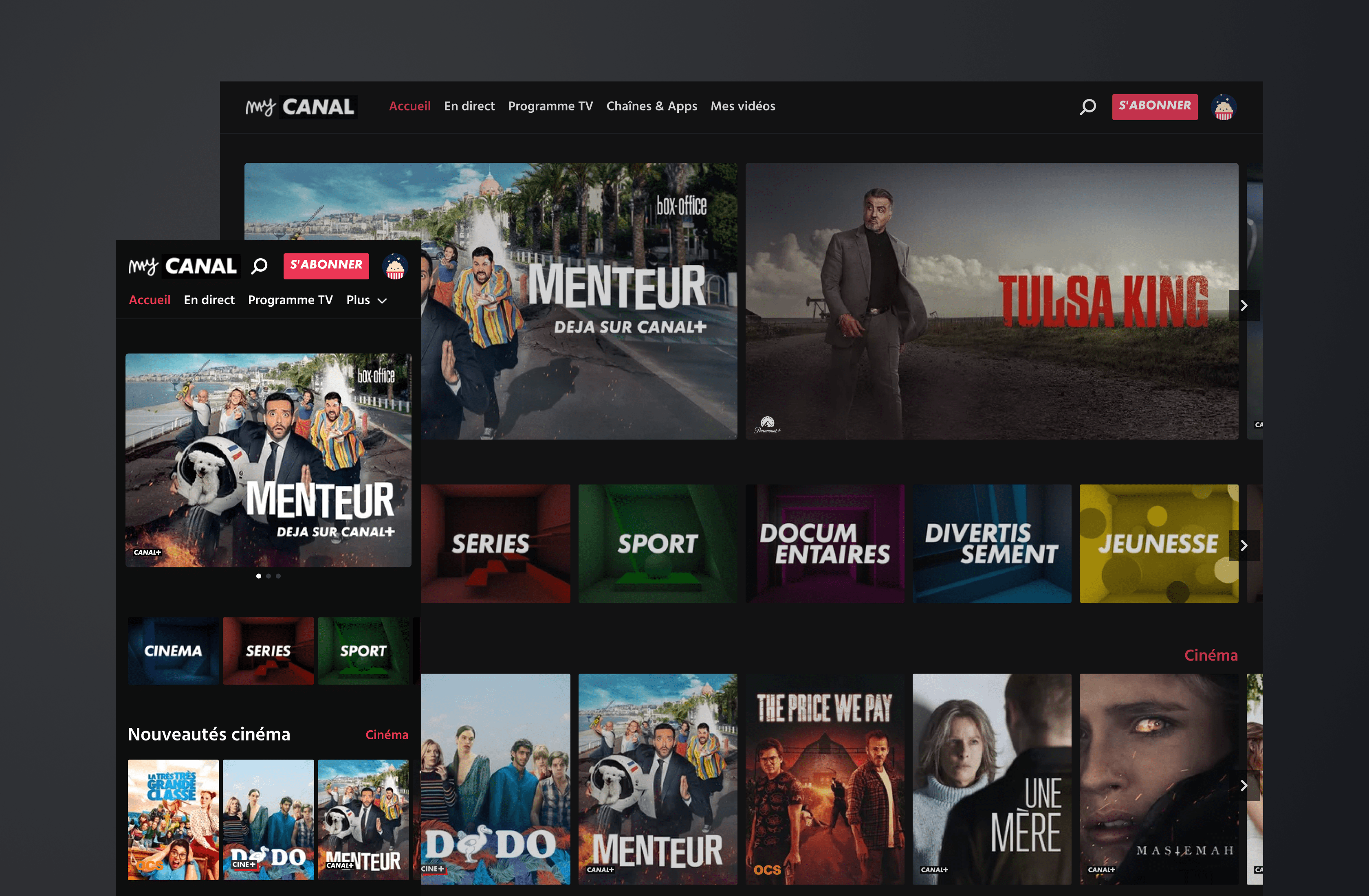
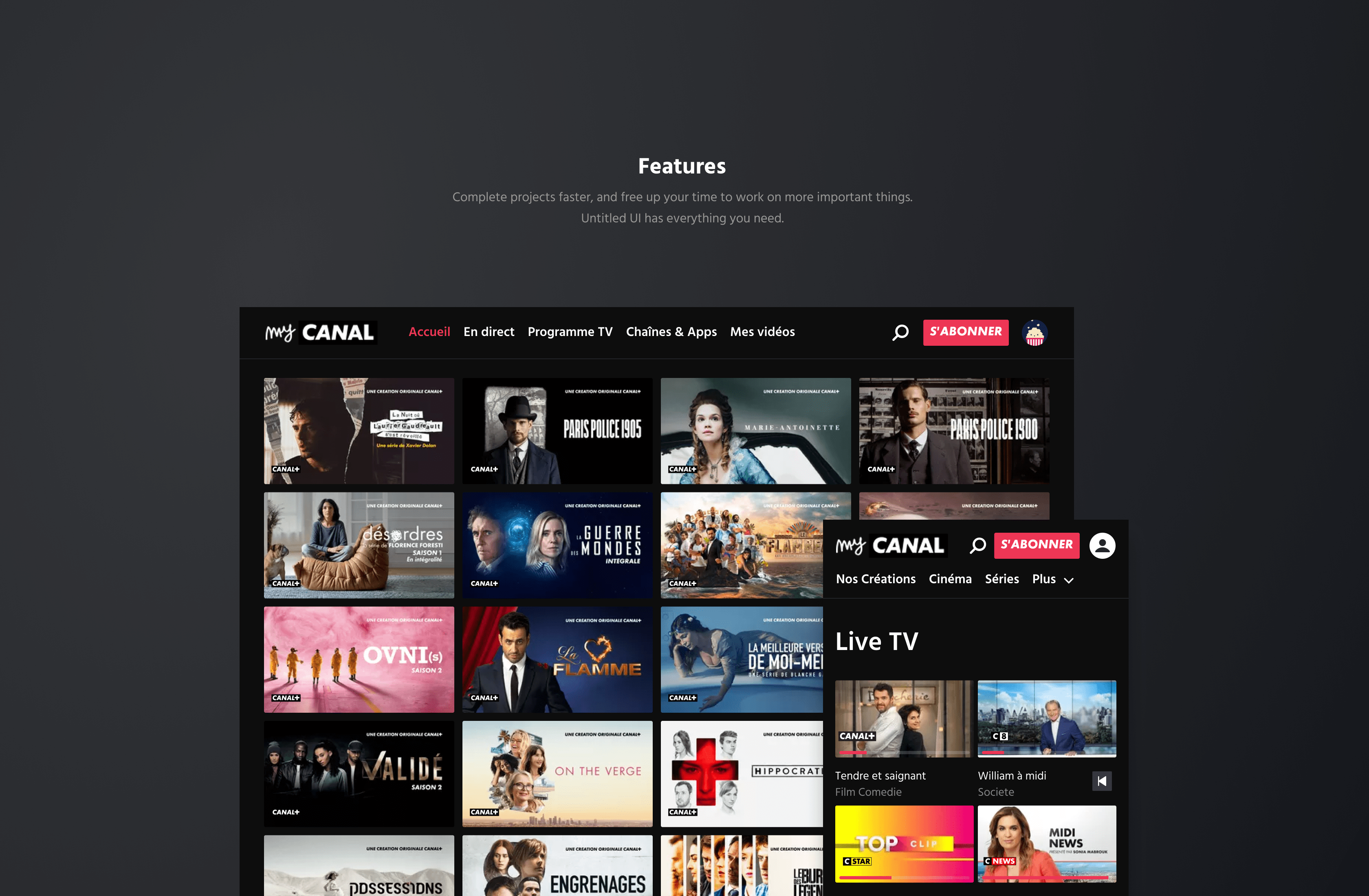
They also sought to make the UX more consistent across all platforms (mobile, web, TV), ensuring that every user could find a similar interface and functionality whatever their device.
Solutions
A scalable, easily accessible design system:
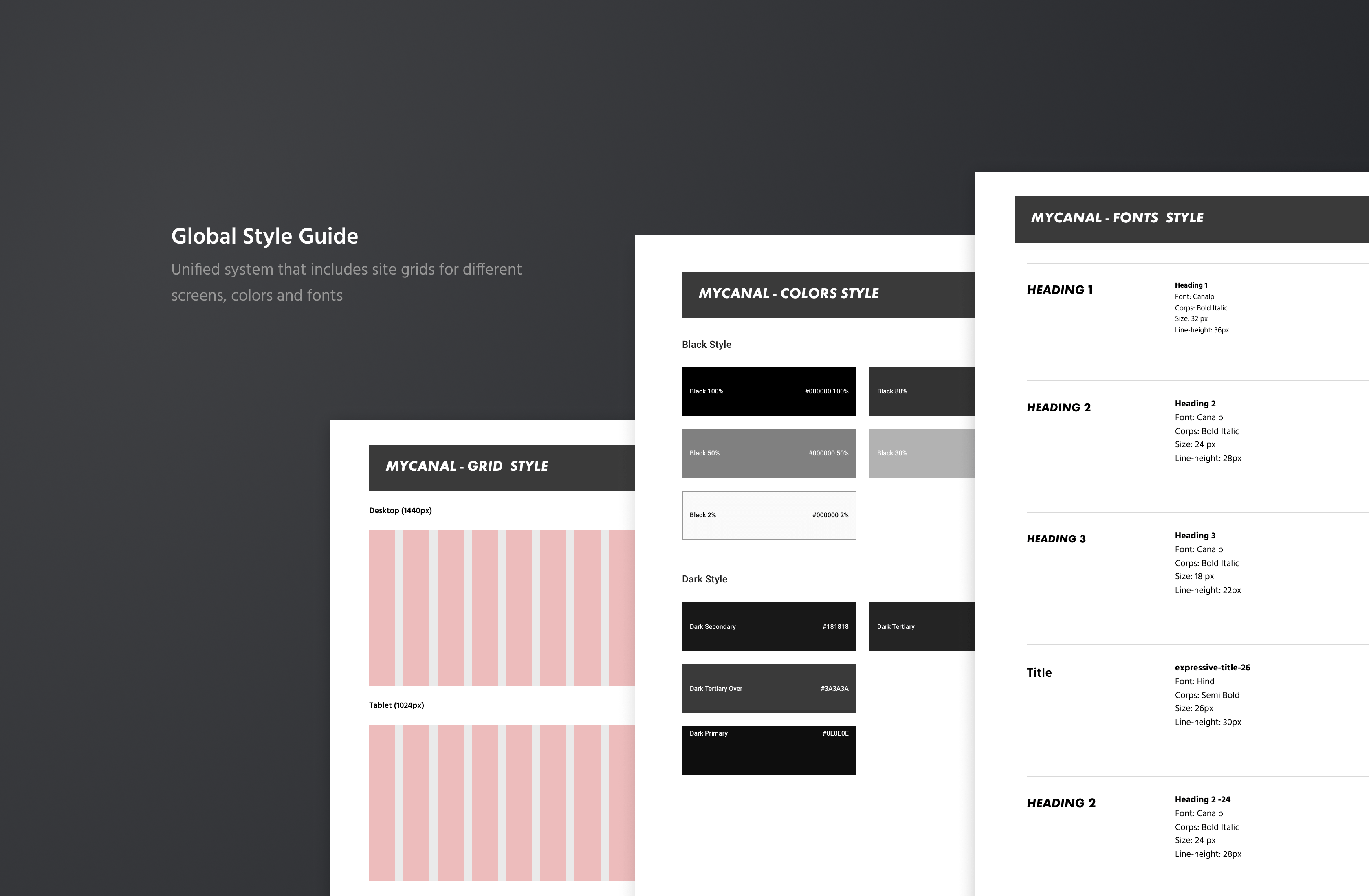
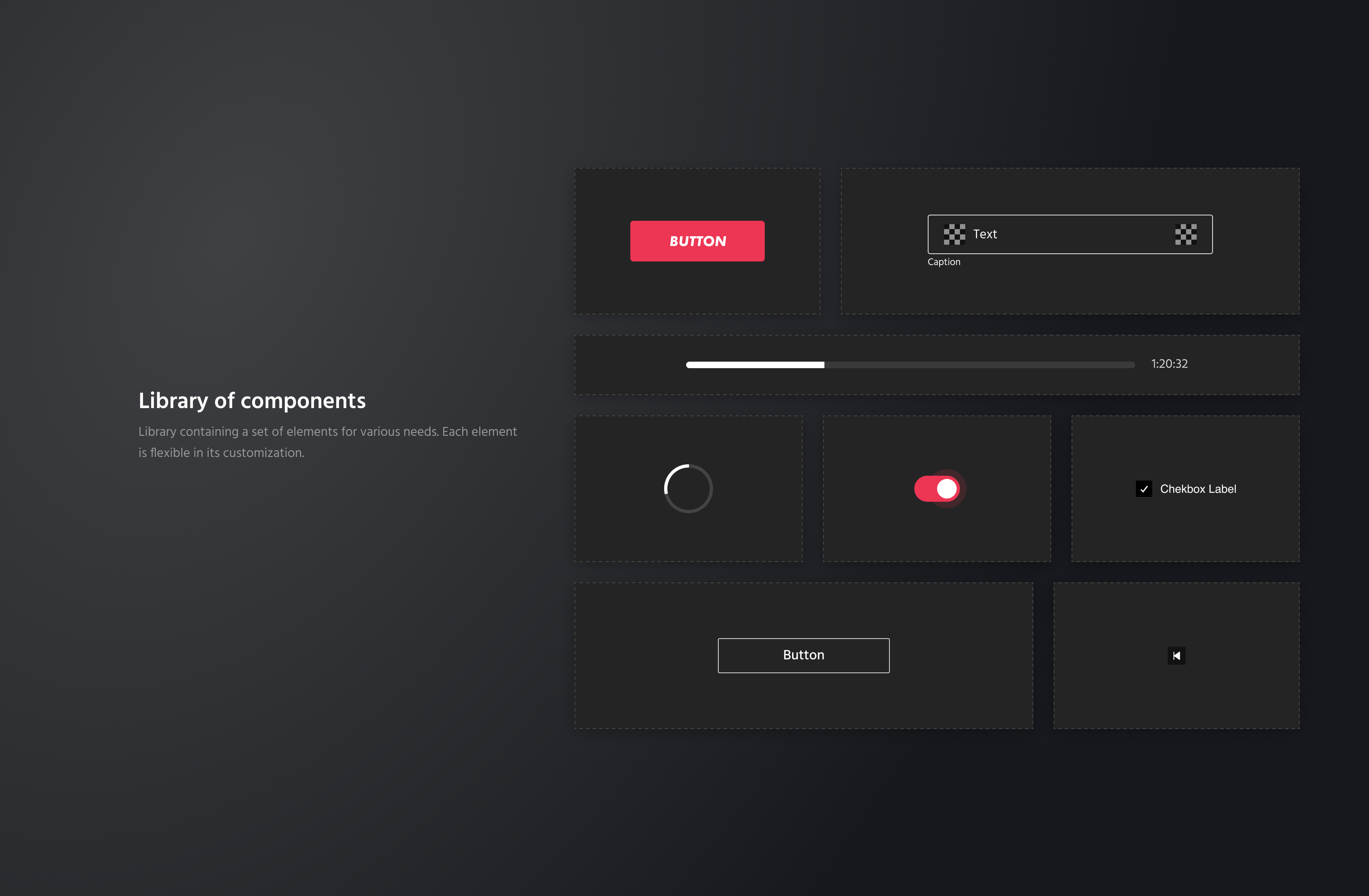
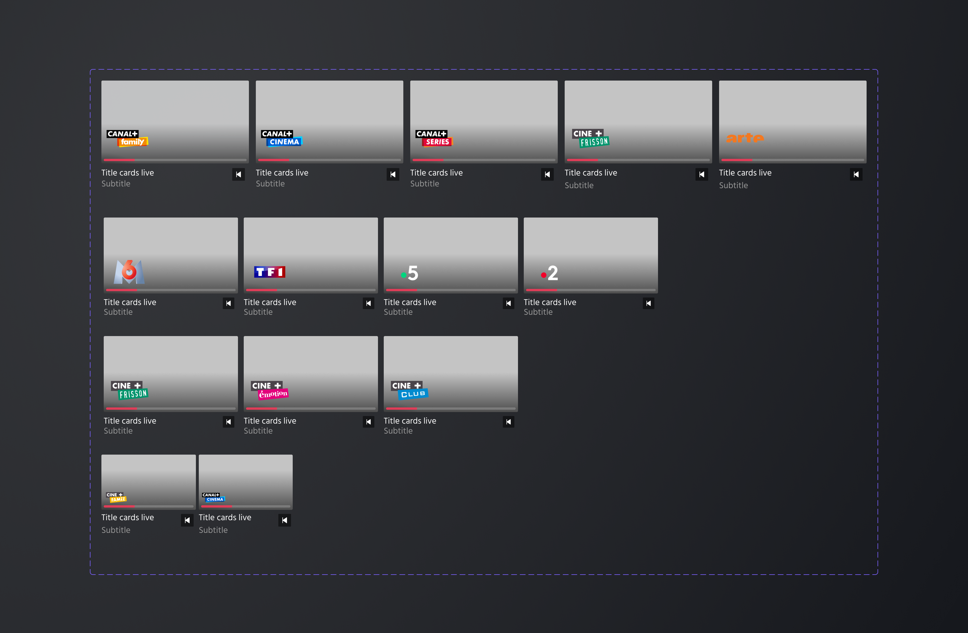
Shared libraries: teams can create libraries of components (buttons, typography, icons, etc.). This guarantees uniformity of design elements across all digital projects, from websites to mobile applications.
Updates to the design system can be made in Figma libraries, and all teams using them benefit from real-time changes, which is particularly useful for a brand where details must constantly reflect the corporate image and visual consistency.
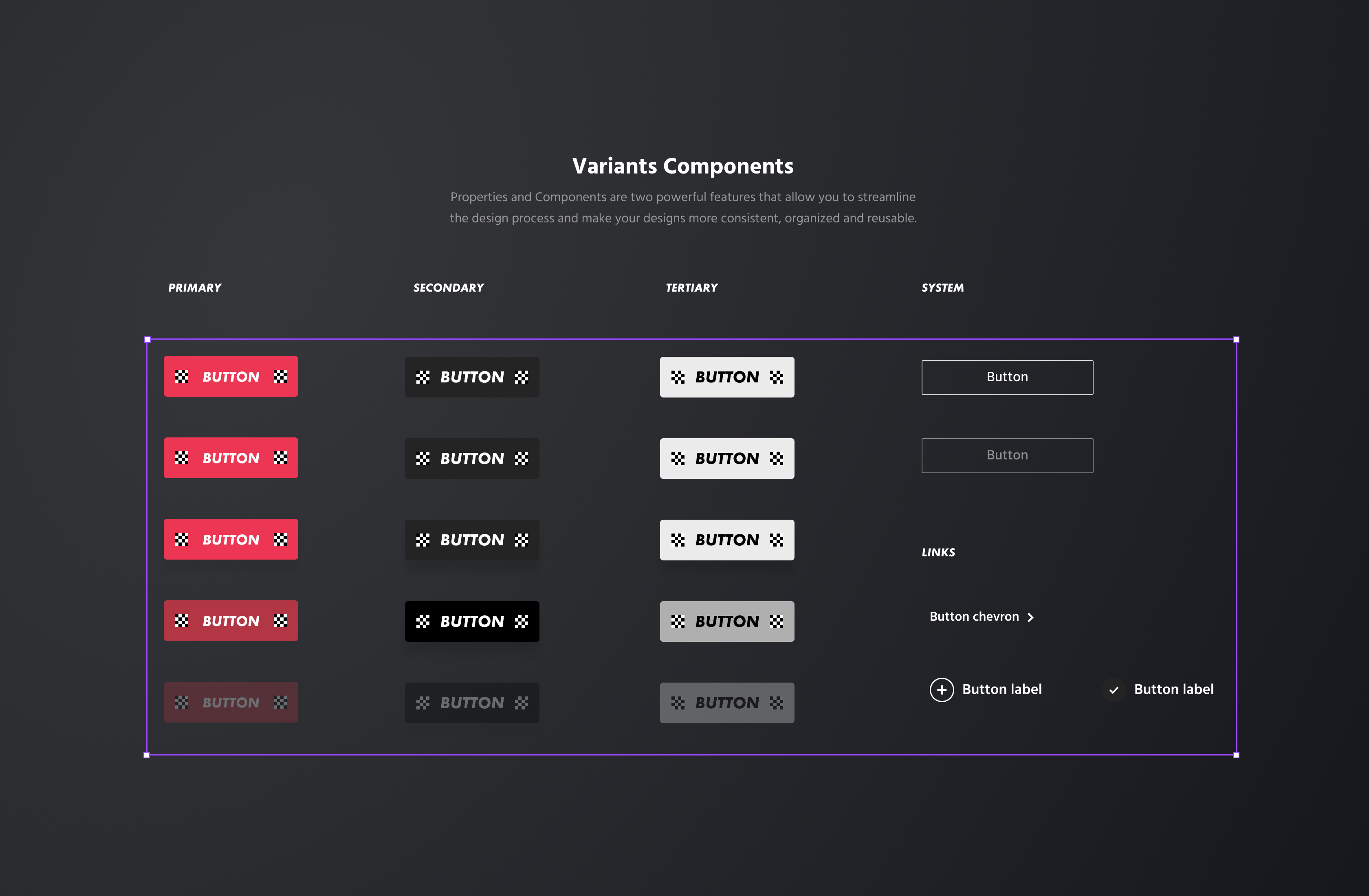
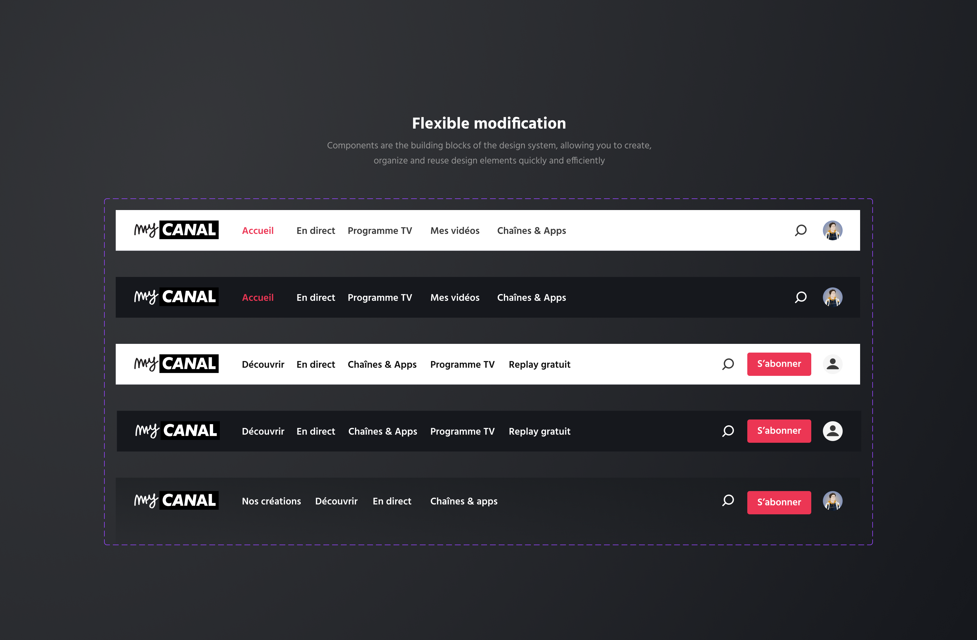
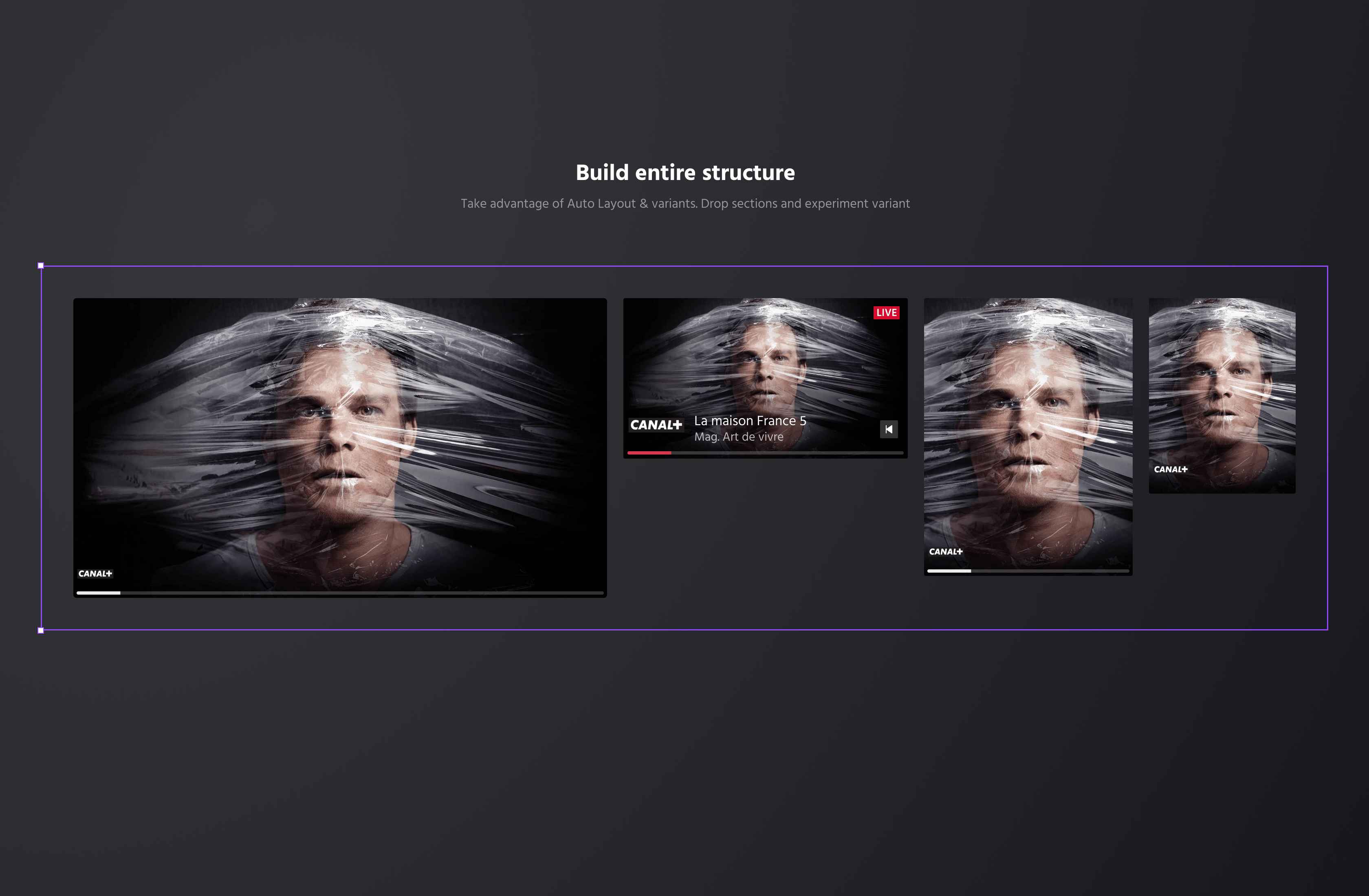
Variant management makes it possible to create different versions of components while maintaining a common structure. To have different header styles for different sections of their website, while maintaining a common base.
Teams can document detailed specifications on typography, spacing and interactions directly within projects.
Results
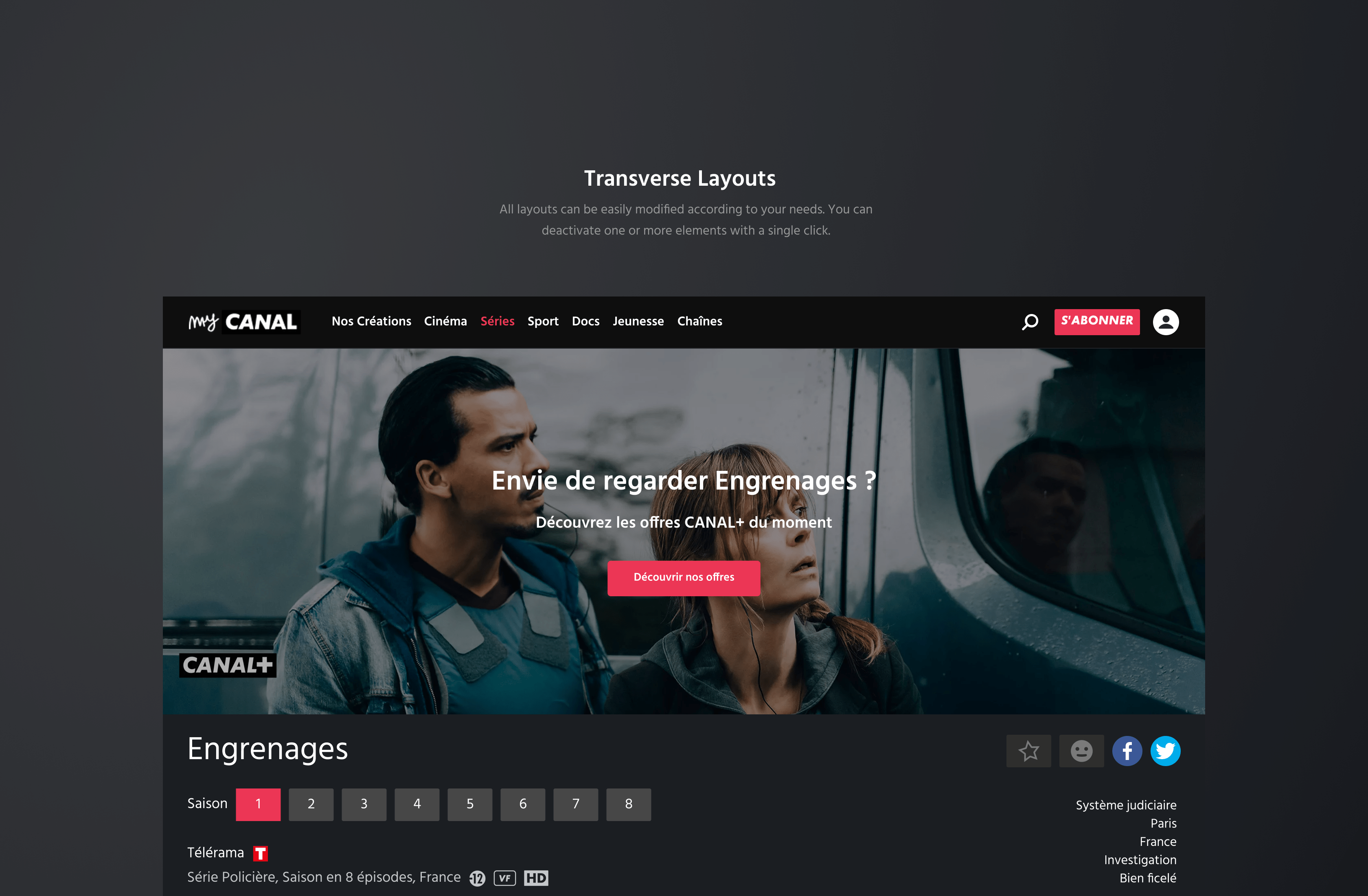
User interface redesign: A partial redesign of the interface has standardized the experience across different devices (smartphones, tablets, smart TVs). This user-centric approach has resulted in more intuitive navigation, with simplified menus and improved accessibility to popular content.
Feature synchronization: The team ensured that new features, such as replay and watchlists, were available and perfectly synchronized across all devices. This encouraged more seamless use between mobile and TV, improving engagement and loyalty.
Their user-centric approach and innovation has enabled the platform to consolidate its position in the fast-growing streaming market.


