Decathlon
United France
Decathlon United adopts a user-centric approach with a global, collaborative vision. Their aim is to deliver simple, high-performance digital experiences tailored to a global audience. Product design at Decathlon United covers various aspects, from interface design to user experience, as well as technological innovation initiatives to support the group's business.
Context
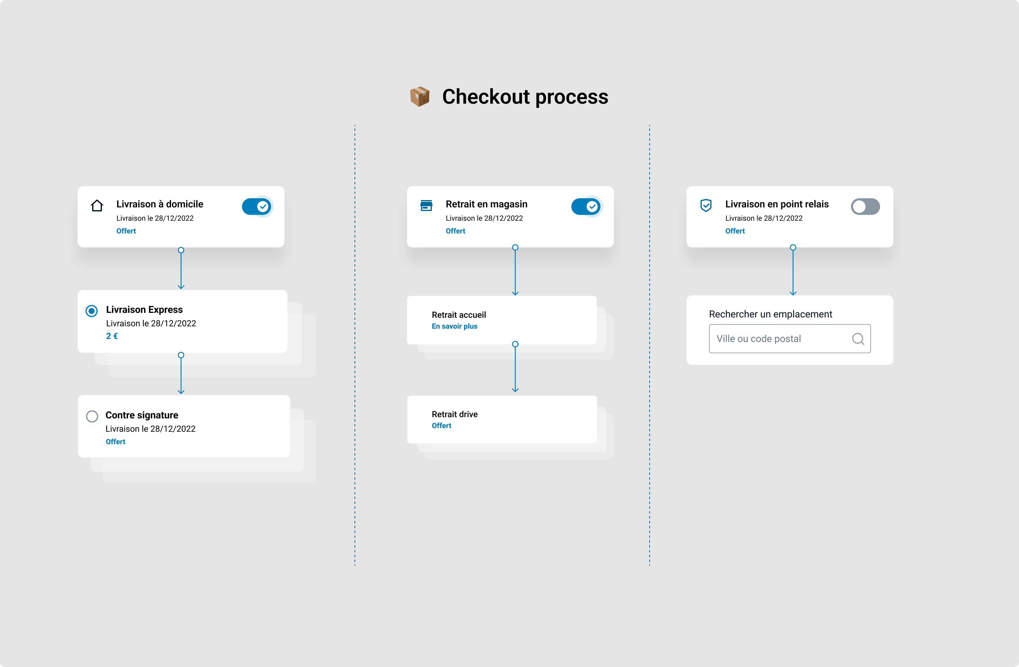
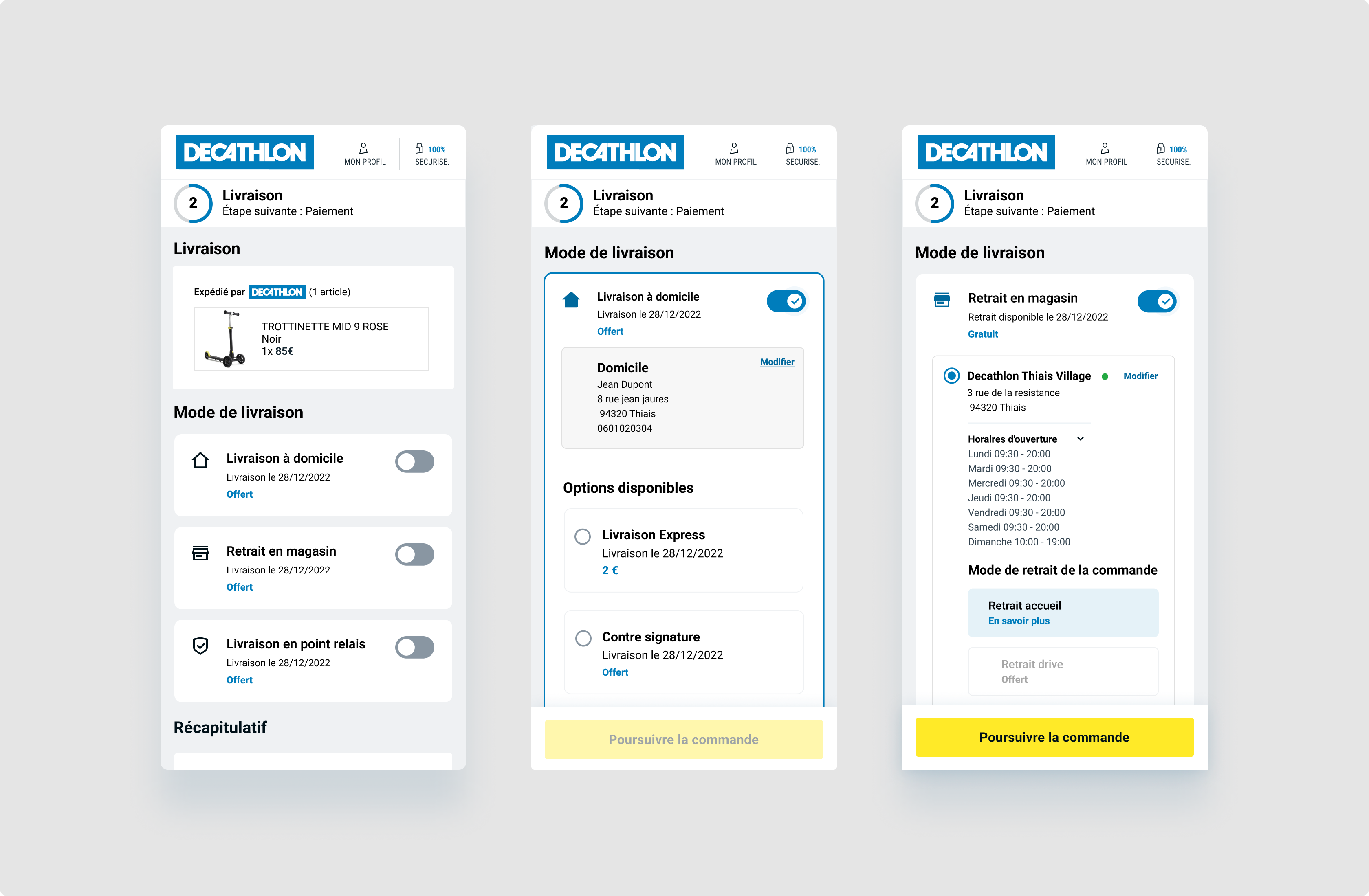
Decathlon has carried out a significant overhaul of its checkout process to improve user experience and simplify online shopping, following Covid-19. The redesign was aimed at resolving a number of issues encountered by users, including the complexity of the purchasing process, friction during checkout, and frequent cart abandonment.
Team
The product team responsible for checkout at Decathlon United played a key role in redesigning the online purchasing process. This team, composed of several profiles with complementary skills, was organized around an agile framework, favoring collaboration, rapid execution and adaptation to user needs.
The team worked in iterative development sprints (2 weeks), following agile principles. At the end of each sprint, new features were demonstrated to all stakeholders, followed by feedback and adjustments.
Problematic
Following Covid 19, with the temporary closure of many physical stores and social distancing, Decathlon observed an exponential increase in online purchases.
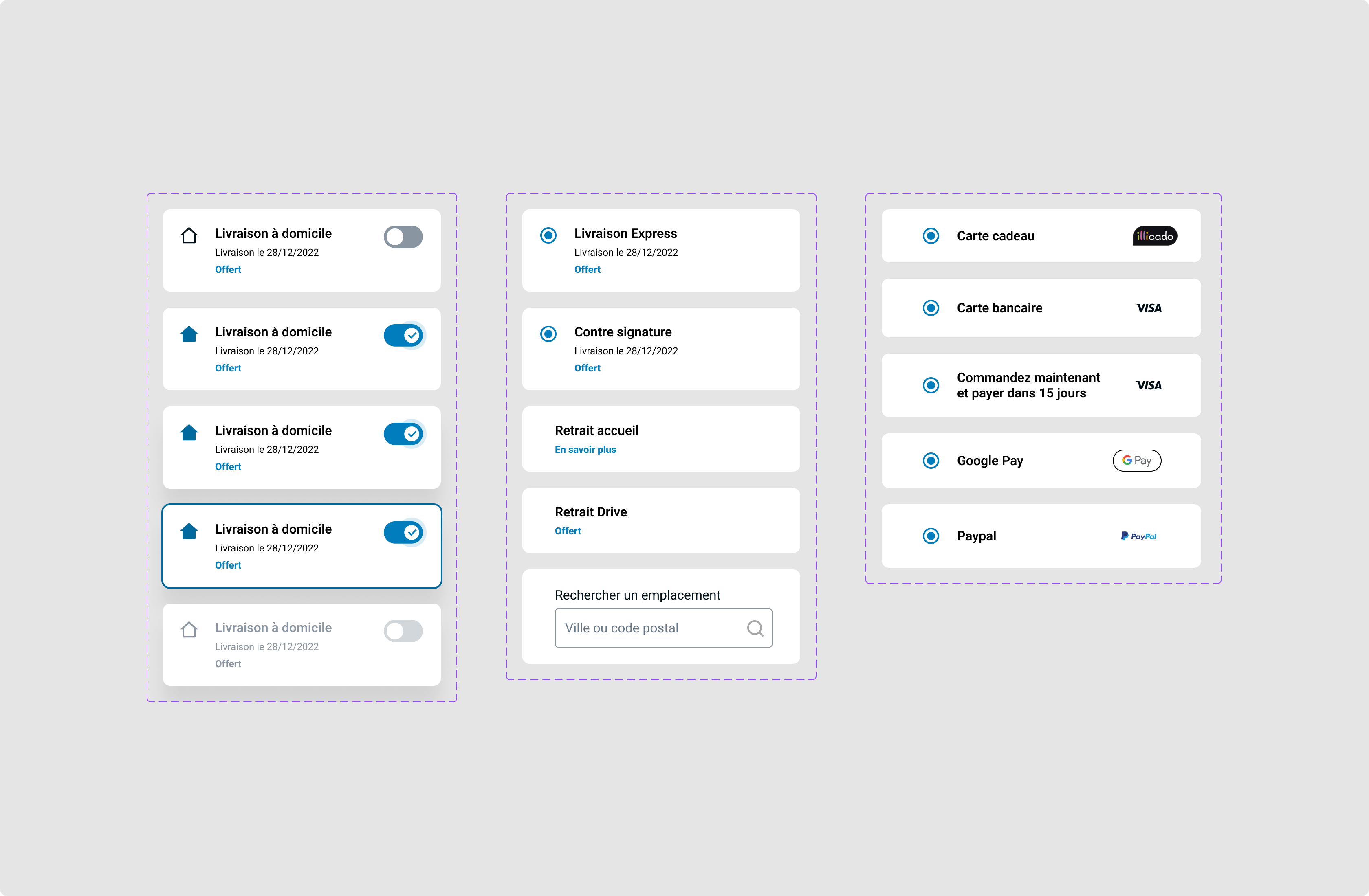
One of the major obstacles identified was the complexity of the payment process. Too many steps or too much detailed information requested from users could lead to shopping cart abandonment. The team had to focus on reducing the number of steps required to complete a purchase.
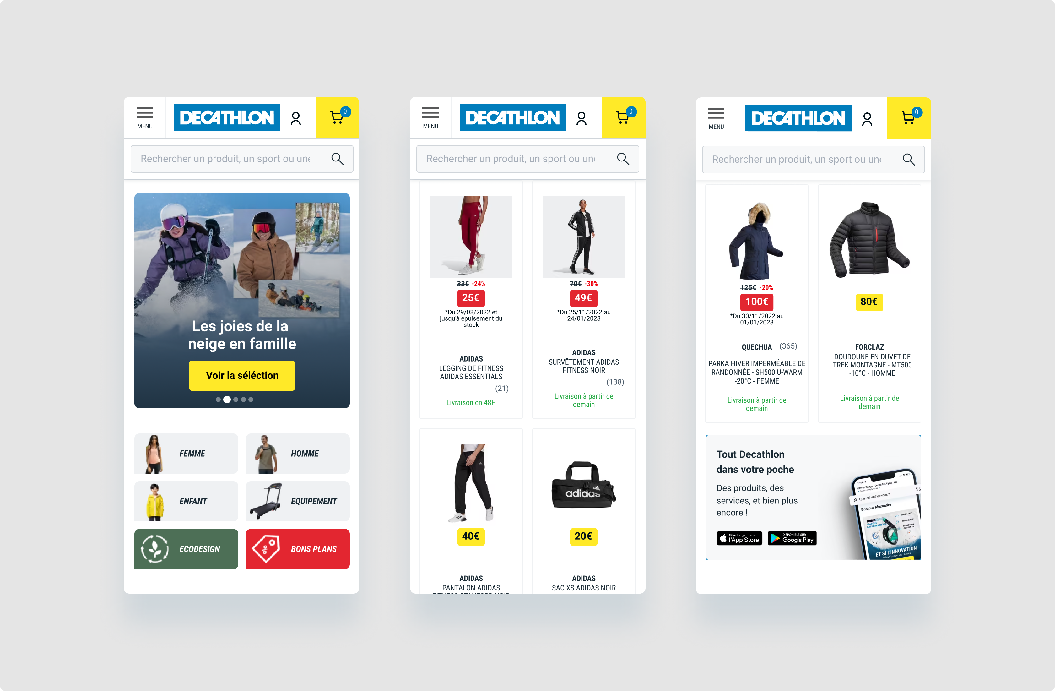
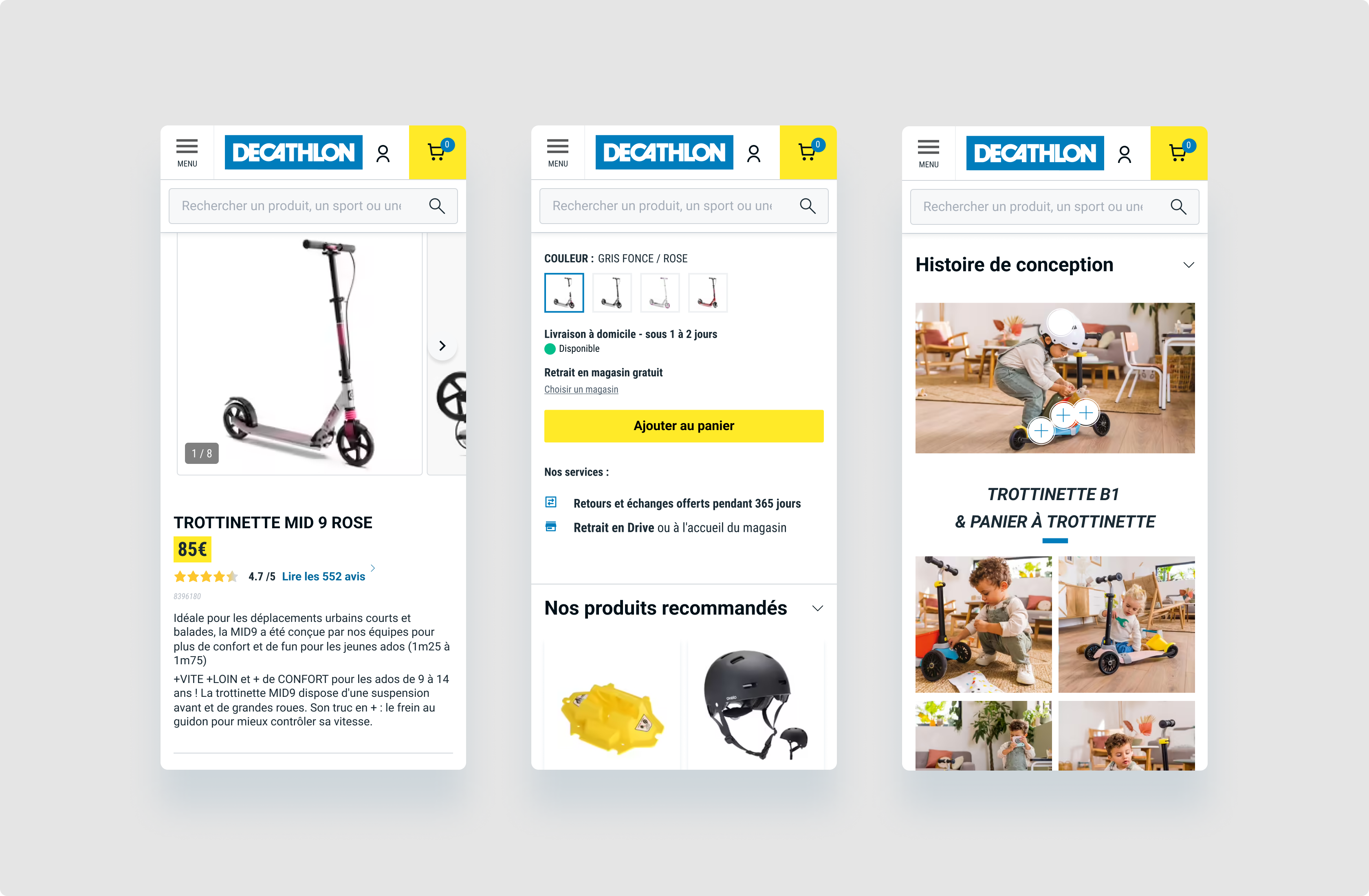
With a growing share of traffic coming from mobile, the product team had to ensure that the checkout was fully optimized for mobile users. This included not only responsive design, but also adapting payment methods and forms for faster, more intuitive interactions on smartphones.
Solutions
Teams needed to be agile and responsive to customer feedback, which required an effective feedback collection system to quickly adjust checkout functionality as needed.
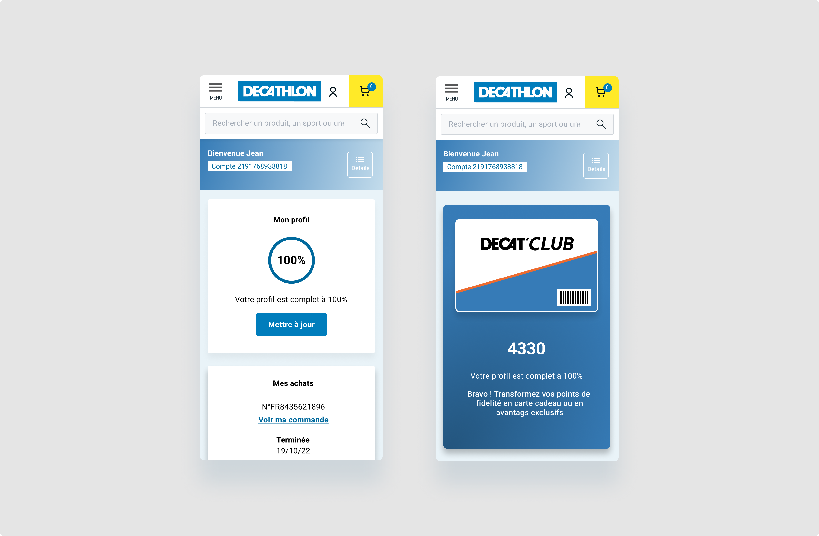
The product team had to find ways of offering a personalized checkout while respecting user preferences. It needed to monitor key indicators such as conversion rates, cart abandonment rates, and success rates for different payment methods. Collecting and analyzing this data was crucial to guiding decisions and prioritizing checkout improvements.
Results
This checkout redesign at Decathlon United has significantly improved the efficiency of the customer journey, boosted conversion rates, and delivered a much smoother and more enjoyable online shopping experience.
Teams rely on in-depth research, including behavioral studies, user interviews, prototype testing and quantitative analysis to identify user needs, frustrations and expectations.


